The Psychology of Great Onboarding: How Consumer Apps Keep Users Coming Back
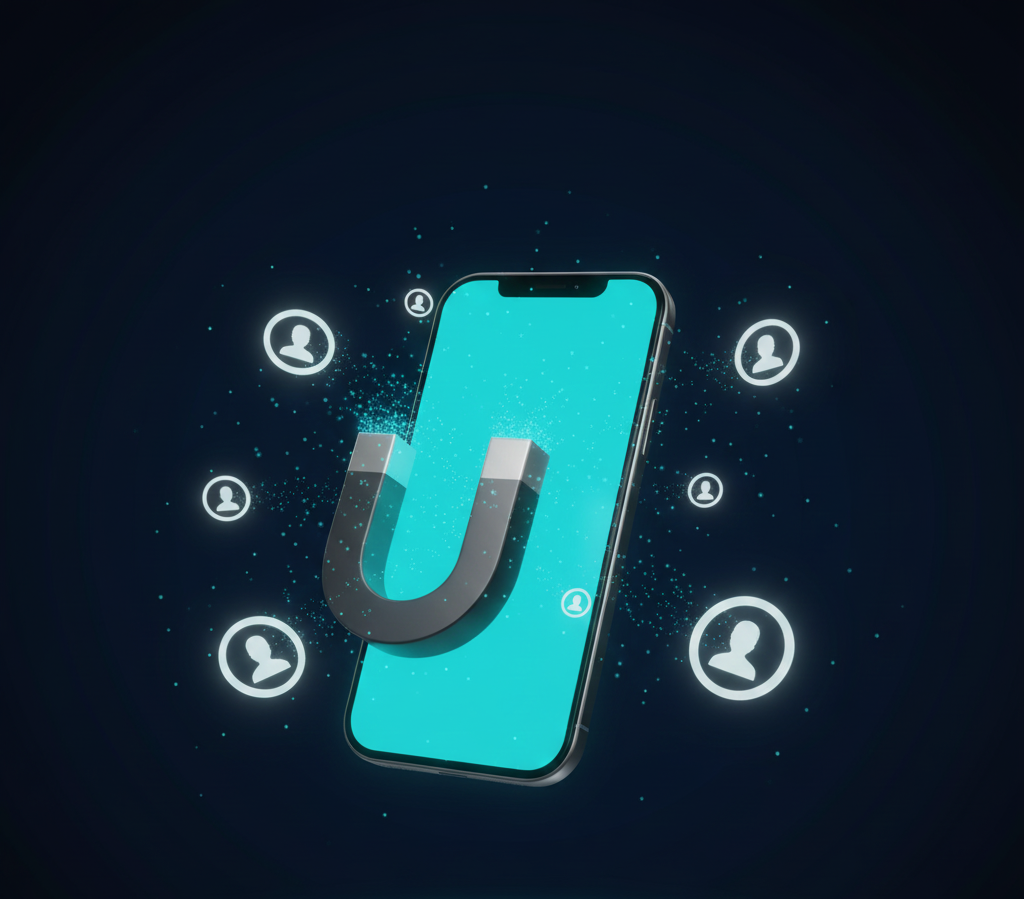
Picture this: You’re at a dinner party. You meet someone new. Within the first 7 seconds, your brain has already decided if you like them, trust them, and want to keep talking to them. Similarly, users make that same split-second judgment when opening consumer apps for the first time. If the experience isn’t seamless, they move on, making those first few moments the ultimate stress test for modern consumer apps.
When a user downloads your app, they are standing at the metaphorical door of your party. If the music is too loud, the lights are off, and they can’t find the snacks, they are leaving. And unlike a polite dinner guest, they won’t say goodbye, they’ll just hit “Delete.“
Here is the hard truth: 77% of users abandon an app within 3 days of installing it.
At DevDefy, we see this constantly. Founders come to us with technically brilliant code; however, their retention metrics are flatlining. Why? Because they treated User Onboarding as an afterthought.
Onboarding isn’t just a “tutorial.” In reality, it’s one of the most critical business strategies you have. More importantly, it bridges acquiring a user and retaining a customer.
What Really Is Onboarding?
To be clear, most developers think onboarding is that 4-slide carousel that pops up when you launch an app. You know the one, where users frantically tap “Skip” just to get to the actual content?
However, that’s not onboarding. It’s a barrier.
In other words, true onboarding is a full UX experience that bridges the gap between “External Curiosity” and “Internal Competence.”
Ultimately, your onboarding flow must clearly make the payoff obvious for the user’s time and attention. Its purpose is to transform a passive install into an active user.
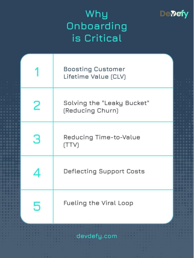
Why Onboarding is Critical
1. Boosting Customer Lifetime Value (CLV)
A user who completes onboarding is more likely to convert and stick around which increases customer lifetime value (CLV). Apps like Robinhood and Coinbase understand this: their onboarding quickly guides the user through setting up security features and making their first trade, As a result, users experience immediate value and CLV increases dramatically.
2. Solving the "Leaky Bucket" (Reducing Churn)
Every successful onboarding step is a barrier against churn. Otherwise, your Customer Acquisition Cost (CAC) becomes a sunk cost the moment the user leaves. In other words, poor onboarding turns expensive marketing into a “leaky bucket.”
3. Reducing Time-to-Value (TTV)
The primary purpose is to race the user to the “Aha! Moment.” If your app is designed to save users time, you can’t waste their time teaching them how to use it. For Airbnb, the TTV is seeing available properties filtered by their dates. However, for Spotify, TTV is hearing a high-quality track playing on the device, not just signing in.
Therefore, every extra step before that moment increases abandonment risk.
4. Deflecting Support Costs
A confusing interface leads to confusion. Consequently, confusion leads to support tickets. Good onboarding serves as preventative customer support. Therefore, apps like Airtable manage their immense complexity by using targeted, contextual tooltips that proactively answer common questions. As a result, they reduce dependency on human support.
5. Fueling the Viral Loop
Happy users are your best marketing channel. If a user has a smooth, delightful onboarding experience, they are more likely to share your app and leave a five-star review. However, poor onboarding leads to negative reviews and lower App Store visibility, slowing organic growth.
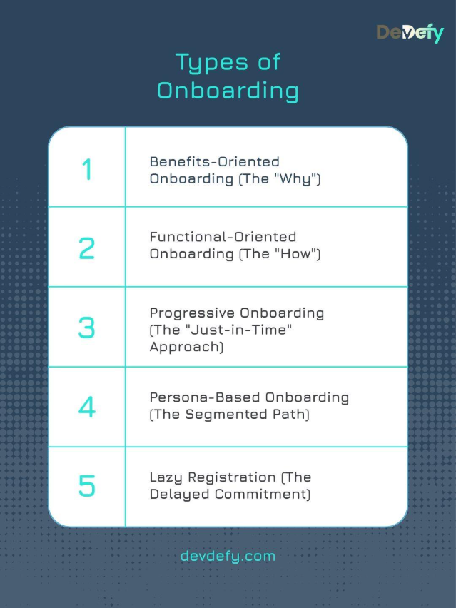
Types of Onboarding
In practice, choosing the right model depends entirely on your app’s complexity and user base. Therefore, there is no one-size-fits-all solution.
Now let’s look at the main onboarding models and when each one fits.
1. Benefits-Oriented Onboarding (The "Why")
This type uses short, visual carousels to showcase the app’s core benefits rather than its functions. Specifically, it answers the question, “What problem does this solve for me?” For example, Tidal uses this to highlight its high-fidelity audio quality and exclusive content before sign-up. As a result, users understand the premium promise immediately.
Ideal Use Case: Simple apps where the utility is obvious.
Presentation Structure: 3-4 punchy slides focusing on value.
2. Functional-Oriented Onboarding (The "How")
This approach is necessary for apps with custom gestures, unique UI, or non-standard interactions. Trello uses this to teach users the critical “drag-and-drop” function for cards and lists, as this action is central to their user flow.
Use when: Complex tools, unique creative apps, or gaming interfaces.
Typical format: Interactive tours or video snippets showing actions.
3. Progressive Onboarding (The "Just-in-Time" Approach)
This is the gold standard for feature-rich products. Instead of front-loading a long tutorial, the app reveals guidance contextually. When a Notion user first attempts to create a new page, a small tooltip appears showing the “Add Block” command, right when they need it.
Ideal for: SaaS, Productivity suites, and tools like Slack.
Delivered as: Tooltips, beacons, and in-app messages tied to specific interactions.
4. Persona-Based Onboarding (The Segmented Path)
Some platforms serve multiple user types. Therefore, segmentation becomes critical.
LinkedIn asks whether the person is looking for a job, networking, or learning. Those seeking employment are directed to upload their resume and complete profile details, while recruiters are taken directly to tools designed for candidate search and discovery.
Recommended Scenario: Platforms with diverse user groups (e.g., two-sided marketplaces, professional networking).
Implementation Pattern: A self-select screen at the start.
5. Lazy Registration (The Delayed Commitment)
Also known as Gradual Engagement, this allows users to browse or interact with the app as a “Guest” before committing to a full sign-up. Any e-commerce appallows you to fill a cart and only asks for your email/password when you click“Checkout.” This gets the user invested before asking for friction.
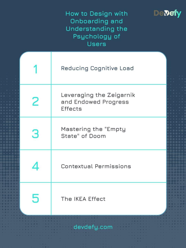
How to Design with Onboarding and Understanding the Psychology of Users
Effective onboarding design is the tactical execution of behavioral psychology. You must leverage behavior triggers to build habit.
1. Reducing Cognitive Load
Cognitive Load is the mental effort required to process information. Too many choices lead to Analysis Paralysis. According to Hick’s Law, decision time increases with options.
A better approach:One Concept Per Screen. When teaching a feature, remove all other navigation elements (e.g., the bottom bar). The user should only have the choice to “Next” or “Back.”
2. Leveraging the Zeigarnik and Endowed Progress Effects
These two effects create an irresistible psychological pull to complete a task.
Zeigarnik Effect: We remember and feel compelled to finish incomplete tasks. When you first sign up for LinkedIn, it immediately gives you a large, persistent progress bar or completeness meter, often titled “Complete Your Profile (50% Done).”
Endowed Progress: Giving a user a “head start” increases their motivation to finish. Coinbase often starts its initial setup progress bar at 20% right after sign-up, giving the illusion of instant progress.
3. Mastering the "Empty State" of Doom
The Empty State is the zero-data screen (e.g., an empty inbox, an empty to-do list). It creates anxiety and confusion.
The Solution: Use illustrations, a friendly tone, and contextual call-to-actions (CTAs). Instead of an empty calendar, an illustration could say, “You have nothing scheduled. Click here to add your first event!”
4. Contextual Permissions
Asking for device permissions (Location, Camera, Microphone) too early is the fastest way to get a user to uninstall. It feels invasive.
A practical fix: Apply the Just-in-Time principle. Only ask for the permission when the user attempts to use the feature that requires it. Slack doesn’t ask for microphone access on launch; it asks only when the user taps the mic icon to send a voice memo.
5. The IKEA Effect
Users value what they have invested time in. The IKEA Effect states that users who customize their product feel a deeper sense of ownership.
Application: Prompt users to choose a color theme, select their interest tags, or upload a profile picture early on. Ultimately, the goal is to make the app feel like theirs before they look for an alternative.
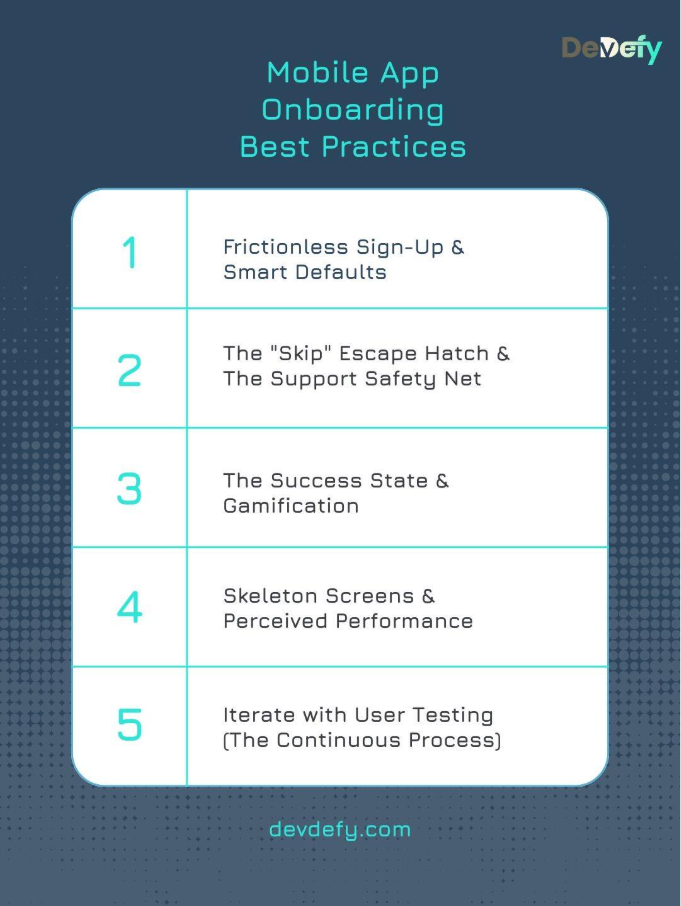
Mobile App Onboarding Best Practices
A flawless onboarding process requires meticulous planning and rigorous execution across both design and development.
1. Frictionless Sign-Up & Smart Defaults
SSO is Non-Negotiable: Offer Google, Apple, and social logins.
Smart Defaults: Automatically pre-fill fields whenever possible. If you know the user’s phone language is English and their IP is in the US, don’t make them select those options manually. Airtable does this well by auto-suggesting timezone and currency based on device settings.
2. The "Skip" Escape Hatch & The Support Safety Net
Always Respect Autonomy: Include a visible “Skip” button on any tutorial. Power users will thank you, and everyone else will appreciate the freedom.
Immediate Support: Place a visible “?” or “Help” icon during setup. If a user hits a technical snag, they must be able to access an FAQ or a chatbot without exiting the flow.
3. The Success State & Gamification
Celebrate the Win: After the user completes the last step (e.g., setting up notifications), display a Success Modal with confetti or a fun animation. As a result, this utilizes Variable Rewards and reinforces the positive association with the app.
Micro-Rewards: Use badges, points, or positive audio cues for every small task completed.
4. Skeleton Screens & Perceived Performance
Avoid the Spinning Wheel: When data is loading (e.g., fetching a personalized feed), don’t display a generic loading spinner. Instead, show a Skeleton Screen, a gray outline of the actual UI elements to improve the perception of speed and reassure the user that content is coming.
Off-App Nudges: Use email and push notifications to guide the user after they have closed the app. A simple Day 2 email with a useful tip can drastically increase Day 7 retention.
5. Iterate with User Testing (The Continuous Process)
Test Early, Test Often: Run continuous User Testing sessions (even with a small pool of 5 users) to observe where they get stuck, confused, or frustrated. In the end, you must test the flow with people unfamiliar with your product.
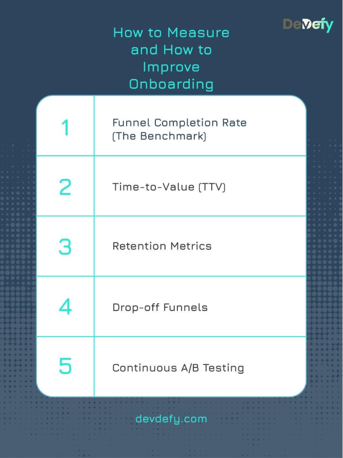
How to Measure and How to Improve Onboarding
From a metrics standpoint, onboarding success is measurable, predictable, and fixable. You must use data to identify the drop-off points in your funnel
1. Funnel Completion Rate (The Benchmark)
Tracking Method: The percentage of users who start the onboarding process and successfully complete the final step.
Optimization Approach: If the rate is low, use heatmaps and analytics funnels to find the exact screen where the biggest drop-off occurs. If the drop-off is at the “Credit Card” screen, the value proposition wasn’t strong enough.
2. Time-to-Value (TTV)
Measurement Criteria: The duration (in seconds or minutes) from “App Install” to the user achieving their “Aha! Moment.”
Acceleration Strategy: Continuously shave TTV by reducing unnecessary steps or removing features that aren’t critical to the core experience.
3. Retention Metrics
To track:
Day 1 Retention: Did they come back tomorrow? (Tests the First Impression).
Day 7 Retention: Are they still using it? (Tests Utility).
Day 30 Retention: Has it become a habit? (Tests Product-Market Fit).
Improvements: Analyze what features Day 7 users use most and promote those features earlier in the flow for new users.
4. Drop-off Funnels
Behavior Monitoring: Set up an analytics funnel that tracks every single tap and screen view during the setup.
Friction Reduction Plan: A significant drop between Screen 4 and 5 indicates excessive friction at that stage. Improving completion rates may require shortening the content, simplifying available choices, or repositioning that step later in the onboarding flow when users are more engaged.
5. Continuous A/B Testing
Experiment Tracking: Test two versions of the same screen side-by-side (e.g., Test A: “Ask for email first,” Test B: “Ask for name first”).
Iteration Process: Use the variant that results in the highest completion rate and repeat the test on the next screen. Onboarding is a constant cycle of testing and refinement.
Mastering the First Minute: 3 Unforgettable App Onboarding Examples (Duolingo, Canva, Headspace)
Studying the best is the fastest path to mastery. Here are three giants who nailed their onboarding for different reasons.
Case Study A: Duolingo (The Gamification King)
Core Onboarding Approach:Duolingo’s onboarding is not just a tutorial; it’s the first lesson.
Critical Behavioral Insight: Duolingo bypasses the traditional language selection step by prompting users to immediately translate a simple phrase. This approach immerses users directly into the core experience before they even realize they have signed up. At the same time, streaks, points, and progress indicators activate the user’s competitive instincts, leveraging Variable Rewards to establish a strong habit loop from the very first interaction.
Case Study B: Canva (The Web-to-Mobile Master)
Mobile Adaptation Method:Canva’s genius lies in simplifying a complex desktop tool for the small mobile screen.
User Experience Breakthrough: They neutralize the “Blank Slate Anxiety” by providing a template based on your immediate need. Additionally, their mobile app uses Contextual Tooltips that pulse where your thumb should tap, making the editing process feel intuitive and avoiding the “feature overload” that plagues similar creative apps.
Case Study C: Headspace (The Value-First Specialist)
Engagement-First Framework:Headspace masters emotional connection and trust before asking for commitment.
Psychological Conversion Trigger: Headspace delivers immediate value by guiding users through a short, calming breathing exercise. By the time the registration screen appears, they already feel relaxed and associate the app with a positive emotional outcome, making sign-up feel like a natural next step rather than a barrier.
What Do These Giants Have in Common?
They Delay Friction: None of them ask for a credit card or complex data on the first screen.
Deliver Instant Value:Duolingo teaches you a word; Headspace makes you relax; Canva helps you design. Value comes before the ask.
Guide, They don’t Lecture: They use interactive, “learn-by-doing” methods rather than static text.
Takeaway: Let's Build an App That Sticks
Ultimately, building a mobile app is easy. There are millions of them. Building an app that becomes a daily habit? That is an art form.
The difference between a deleted app and a market leader often comes down to those first few minutes of the user experience. You need a mix of empathetic design, psychological triggers, and frictionless code.
We don’t just write code; we engineer experiences. We understand that your business goals depend on users falling in love with your product immediately. Whether you are a startup looking for your first 1,000 users or an enterprise looking to reduce churn, we have the blueprint.
Are you ready to build an app that users can’t put down?